
Cato the youngest
Type Design project
This project aimed to emphasise the sculptural qualities of letter design. To make the viewer really look at the shapes, the letters were designed to look strange and "off". Children's handwriting was used as inspiration for this typeface.
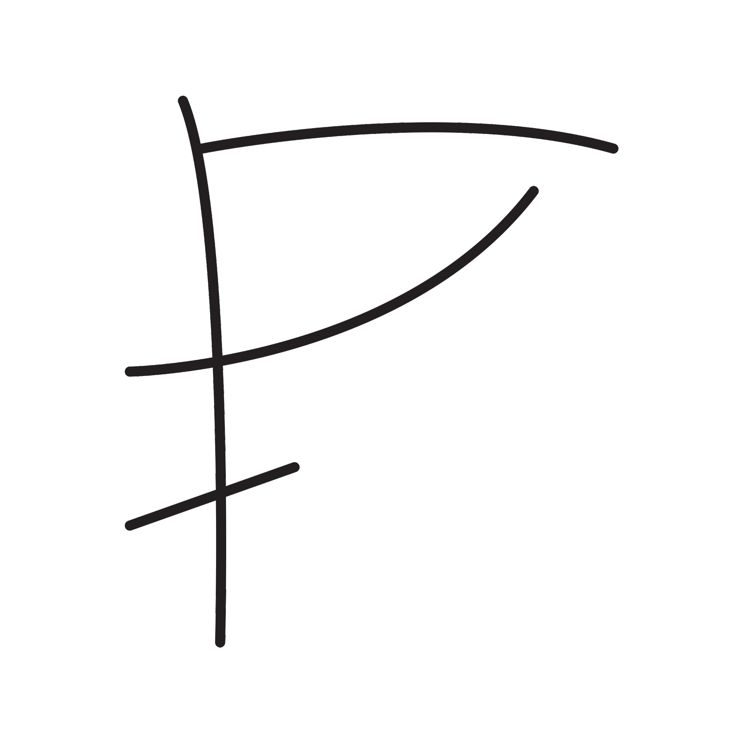
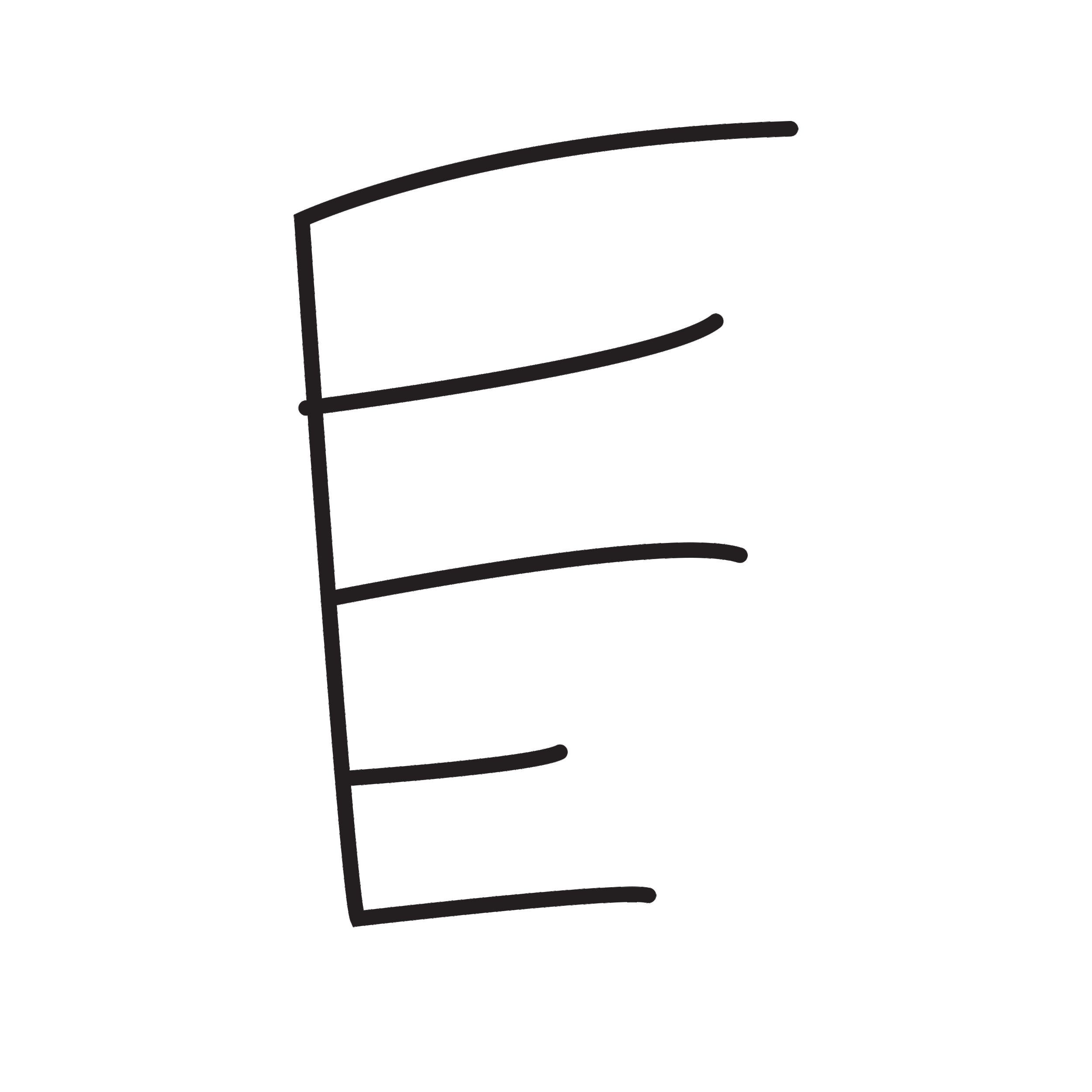
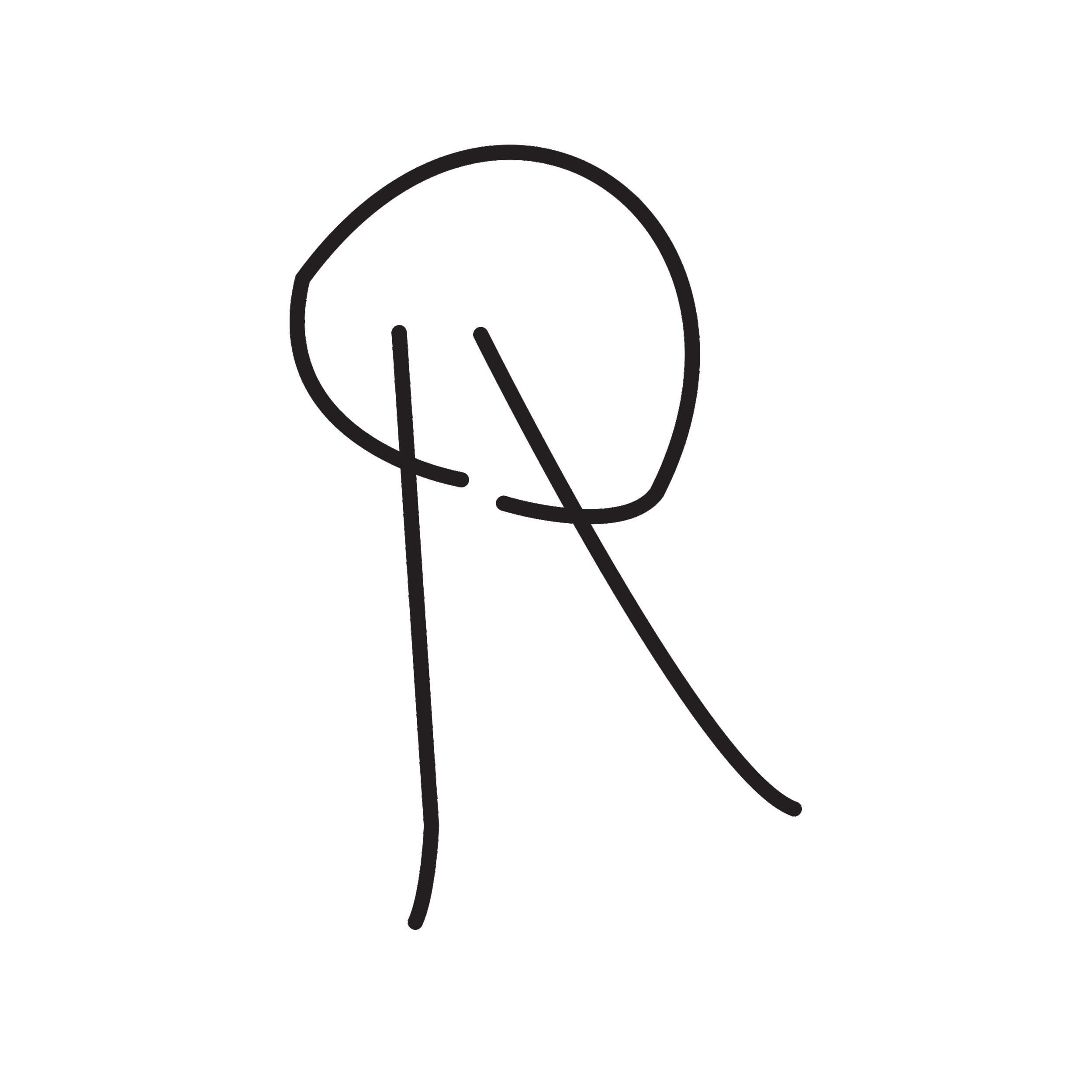
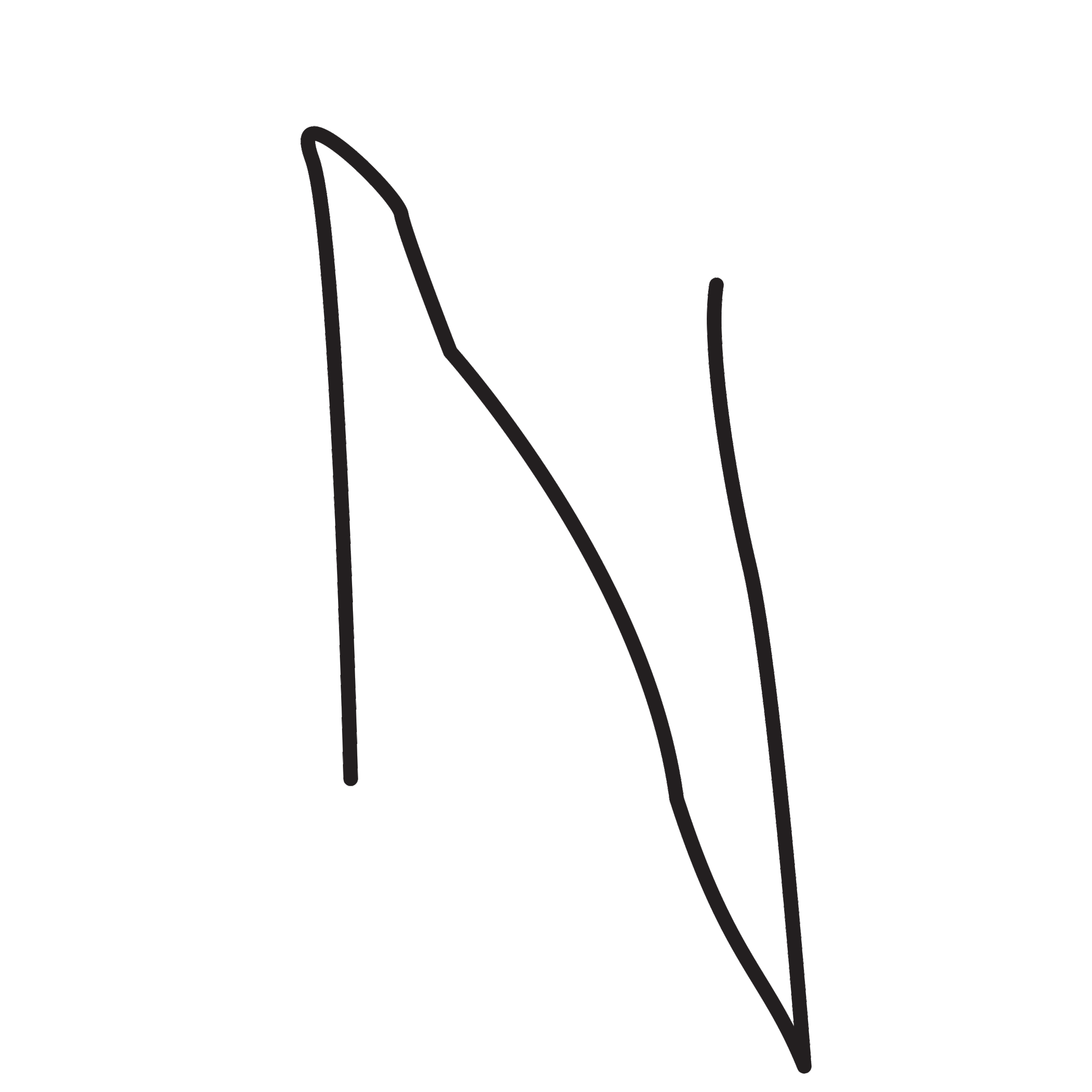

To create the strange typeface, I took inspiration from children's handwriting. When they first begin to write, they can't quite remember how the letters are supposed to be, and details are often quite off. Yet we can still (sometimes) recognise what they are trying to convey in their writings. The most strange letters are often found in their signatures in drawings; Ns facing the wrong way, Es with way too many arms and circular Rs.
The challenge was to make all the letters I collected work together in a system. To make them look similar, I decided to give them serifs and high contrast. This style was itself a fun contrast to the subject matter. Additionally I had to remove certain details from the letters I had collected to reduce the visual clutter, such as the third arm of the E.