Learn the abc
Specimen Book
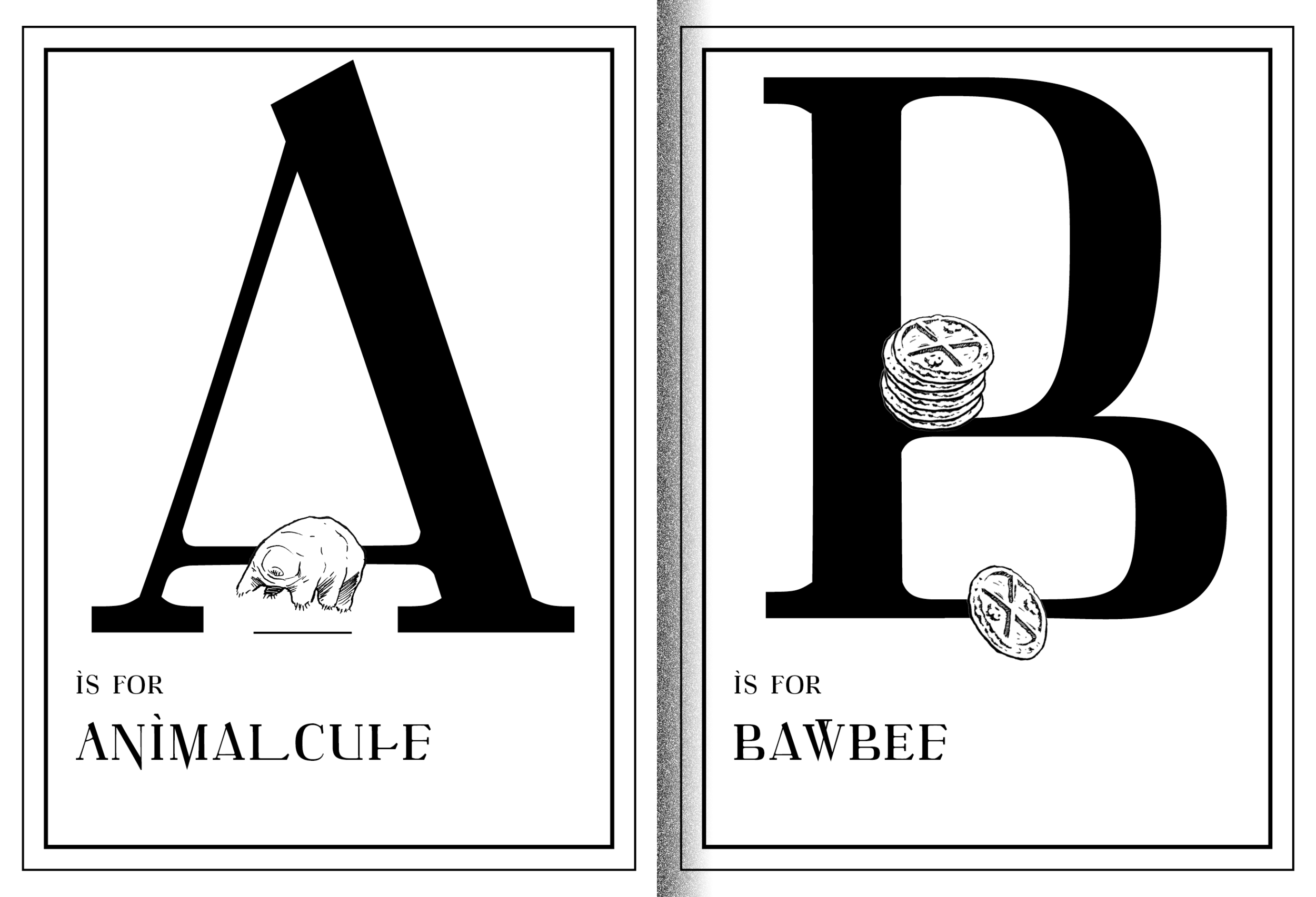
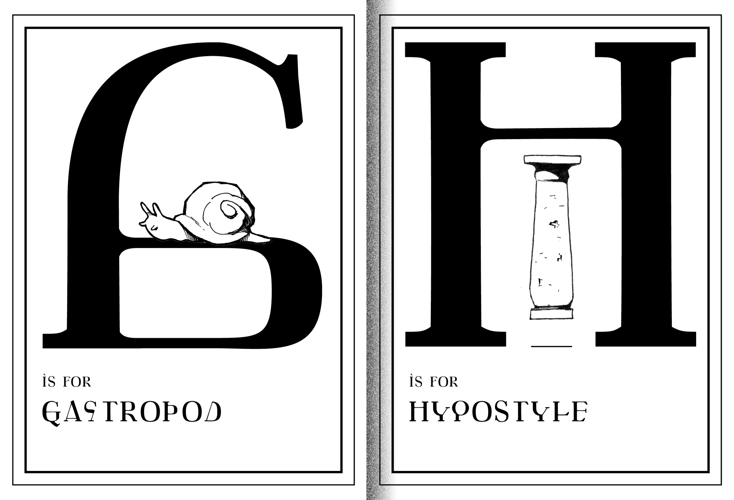
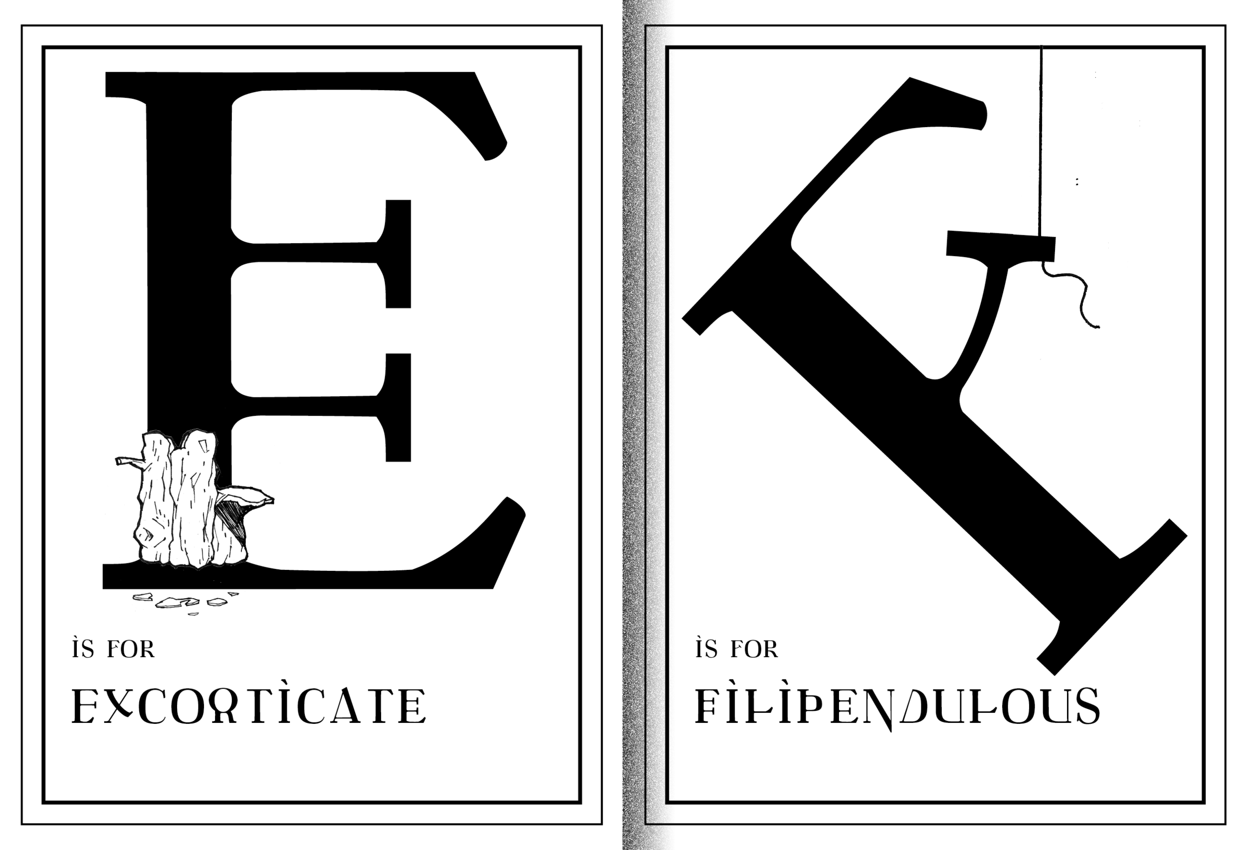
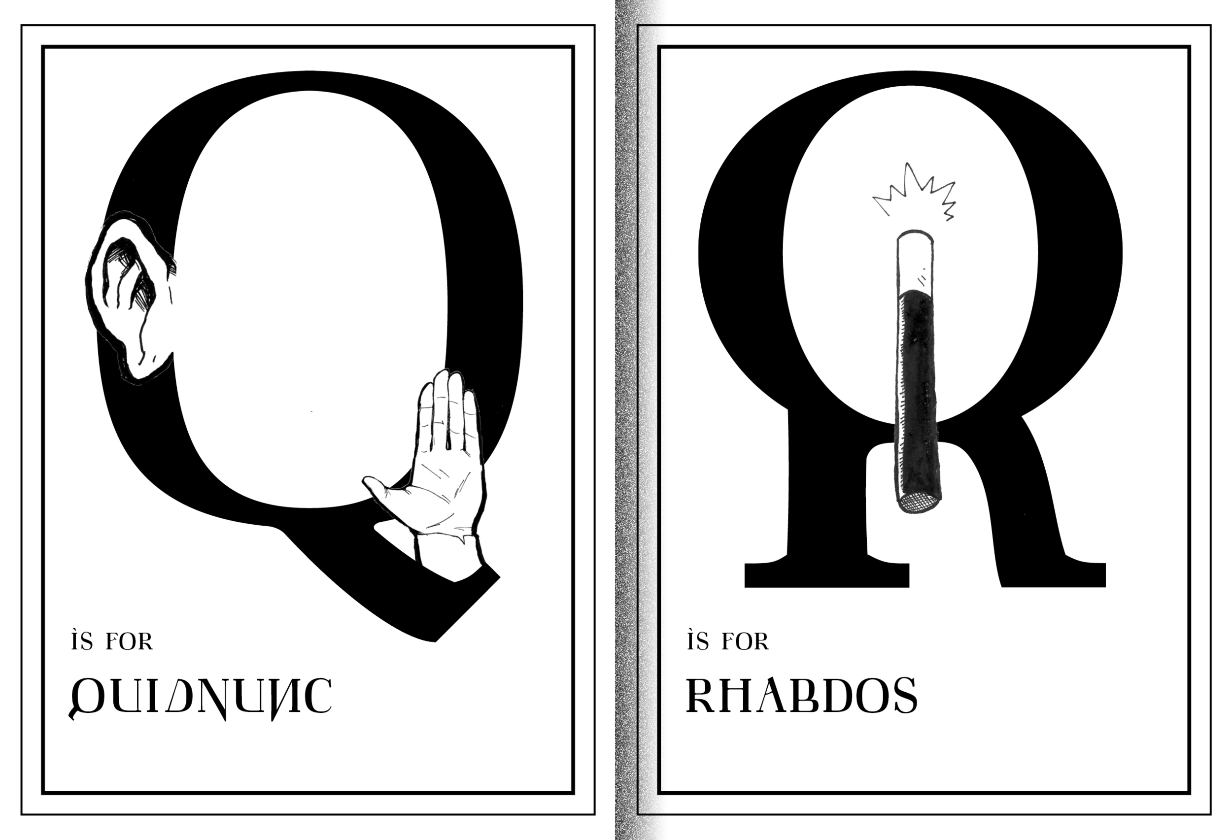
To present the typeface Cato the Youngest I decided to make a booklet. The concept of the font was to present children's handwriting in an absurdly rigid way. Thus presenting the font as a strict victorian era-esque booklet made sense. In the booklet, each letter is coupled with an archaic word and a small illustration. The choice of difficult words in combination with the difficult typeface, strips the letters of their meaning, and the viewer is forced to look at them as aesthetic objects. A small dictionary printed on tracing paper was also provided, to help with the understanding of the words.